ROUGH EDITS
After completing my first draft i was not happy with it at all. The quality of the images were not good at all. The advertisement on the contents page was not bad but i definitely could have done more with the editorial pillars and articles. Additionally i could have added more images and played around more with fonts. As for the double page spread, the article was not long enough and the image i used was too dark. The photos were unclear and i don't think the colour of the background matched the vibe of the magazine at all. However i was happy with how the front cover turned out in terms of the layout. However the image was too dark , making it hard to add cover lines and again the image was not good quality at all.


At this point, improvements were made however it still wasn't looking like how I wanted it to. The image quality improved for the double page spread and i added a second double page spread with a longer article but it still didn't look realistic. There were also still not enough photos and doesn't look realistic at all. I lacked page numbers, finishing the article on the first double page spread and there were still no improvements made to the contents page and front cover. At this point i was really unhappy with how it was looking.
I think what went wrong was poor time management and the lack of knowledge on magazine conventions. clearly I had to start making a lot of improvements.
DRAFT 2

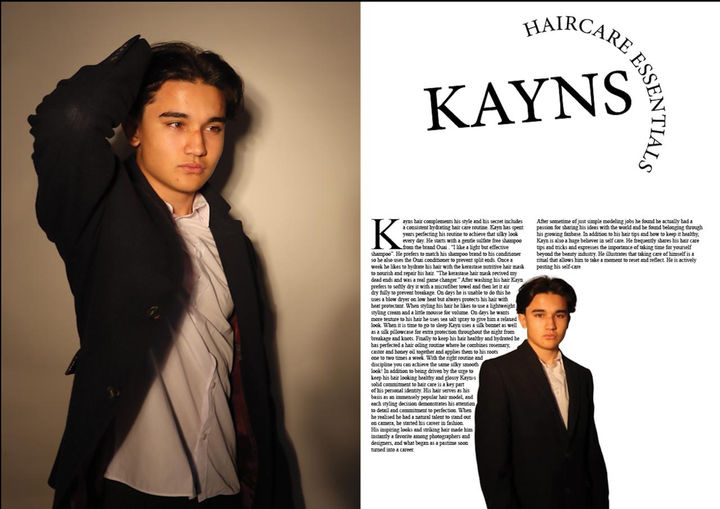
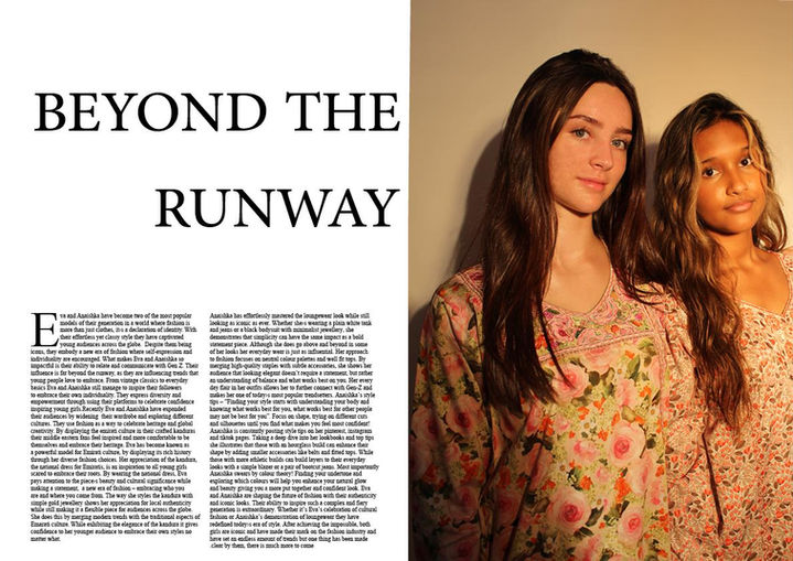

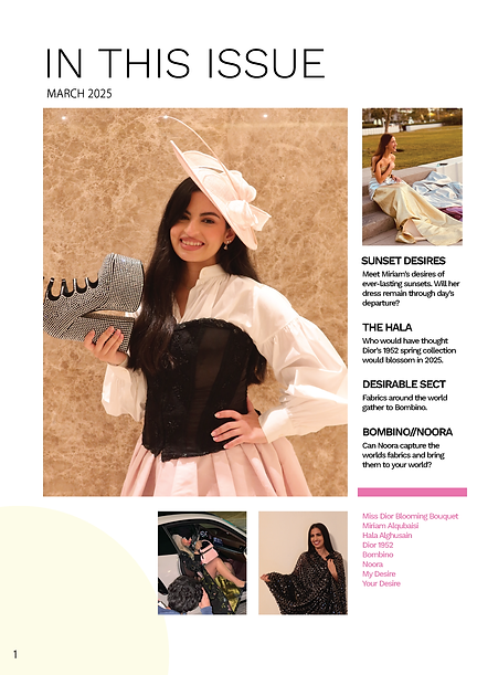
At this point i was so frustrated with how it was going i decided to completely start over and thank god i did. At this point i barely had any time left so i had to rush this. I gathered models (family members and friends) and spent two days taking photos. I then completely restarted the whole process which wasn’t easy. However, the image quality improved, the contents page looked fuller although it still needed more writing, i also added more double page spreads so i could evenly spread articles without letting the articles overpower the images. I added more advertisements and completely changed the colour scheme. At this point i was extremely happy with how it was turning out knowing my hard work was paying off. However there were still improvements to be made.
DRAFT 3